MapKit (18)
Launch Screen 만들기
예전엔 info.plist 라는 파일이 있었으나 지금은 그냥 프로젝트에서 info가 있어서 거기서 수정을 하면 된다.
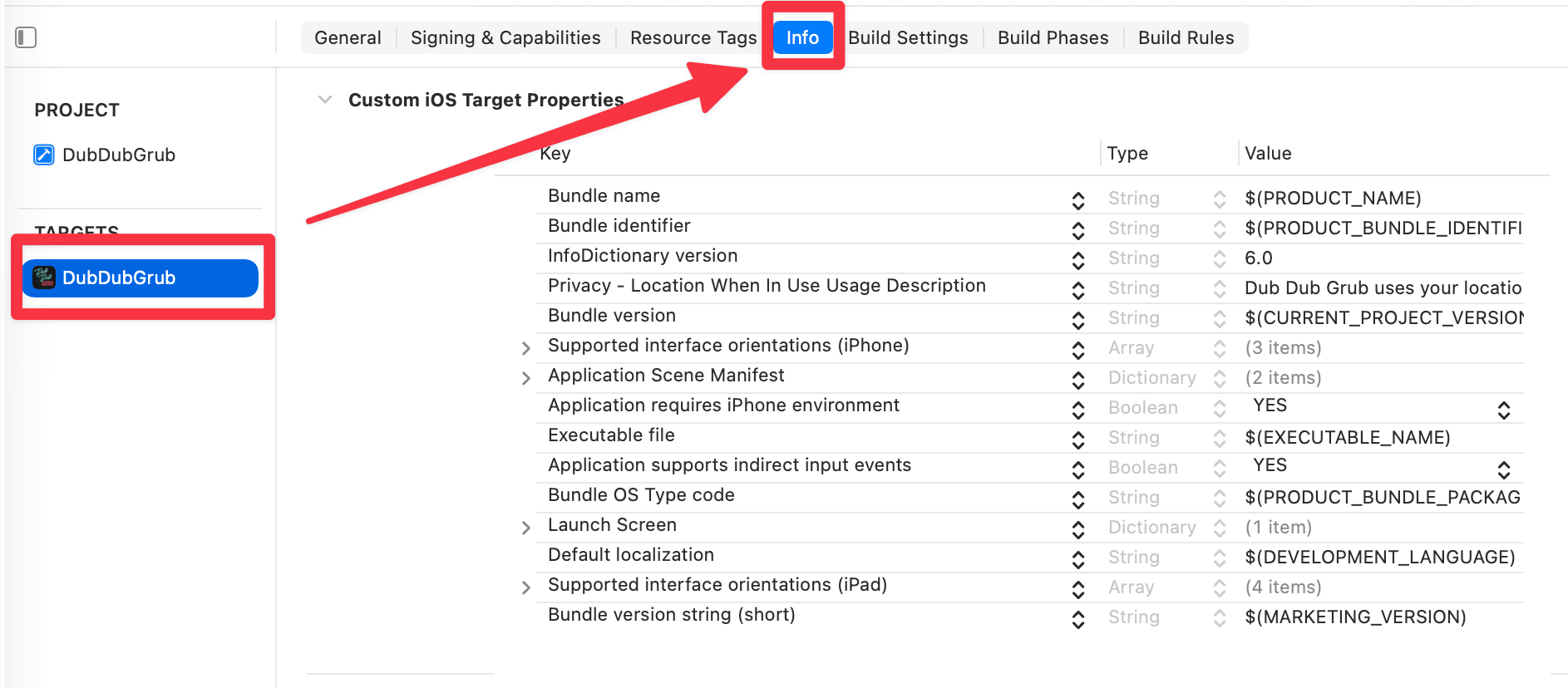
여기서 추가해서

이렇게 Image 이름을 해주면 된다. 이때 이미지 이름을 이렇게 한 이유는
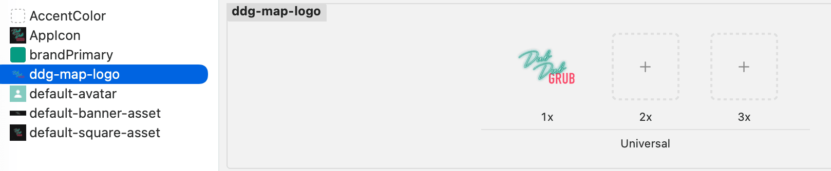
이렇게 Asset에 있는걸 그대로 썼기 때문
그리고 Image respects safe area insets를 추가하여 YES를 해주었다. (사진은 생략)
현재 비교해보면 차이는 없어보인다. 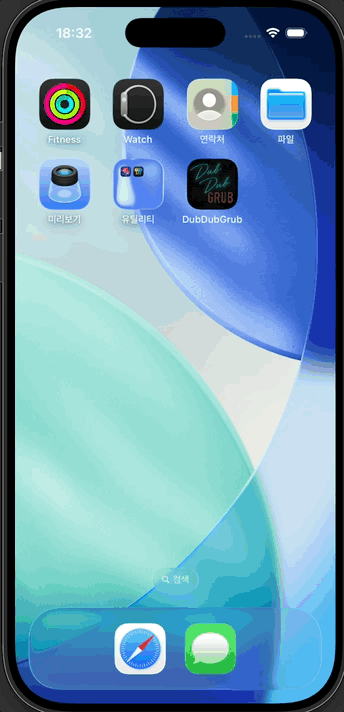

런치 스크린 설정 시 이미지가 노치(Notch)나 홈 바 영역을 침범할지 여부를 결정하는 설정이다.
| 설정값 | 이미지 범위 | 특징 및 용도 |
|---|---|---|
YES (true) | Safe Area 내부 | 노치, 다이내믹 아일랜드, 홈 바를 피해서 배치됨. 로고가 잘리지 않아야 할 때 적합. |
NO (false) | 화면 전체 (Full) | 세이프 에어리아를 무시하고 끝까지 확장됨. 배경색이나 패턴을 꽉 채울 때 필수. |
- 배경 이미지: 화면에 여백이 생기지 않도록
NO로 설정하는 것이 일반적이다. - 중앙 로고: 이미지 자체에 적절한 마진(Margin)이 있다면
NO로 설정해도 무방하며, 시스템 UI와의 간섭을 완벽히 차단하고 싶다면YES를 고려한다.
Haptic Feedback
사실 이건 이전글에서 해봤던 주제이다.
다만 이전글에서 공부했던거랑 지금 강의랑 ios 버전이 다르기에 여기서 진행하는방식은 다를것같다.
Haptic Docs는 여기
관련 영상은 여기
1
2
3
4
func playHaptic() {
    let generator = UINotificationFeedbackGenerator()
    generator.notificationOccurred(.success)
}
우선 View Extension에 다음과 같은 함수를 만들어 주었다.
그리고 체크인/아웃 쪽에 해당 함수를 추가해주었다.
1
2
3
4
5
6
7
8
9
10
11
12
13
14
15
// LocationDetailView
if let _ = CloudKitManager.shared.profileRecordID {
    Button {
        viewModel.updateCheckInStatus(to: viewModel.isCheckedIn ? .checkedOut : .checkedIn)
        playHaptic()
    }
}

// ProfileView
if viewModel.isCheckedIn {
    Button {
        viewModel.checkOut()
        playHaptic()
    }
}
이건 실제 디바이스에서 해야하므로 실제 내 아이폰에 테스트를 해보았다.
혹시나 시뮬레이터에서 잘되다가
Unable to process request - PLA Update available: You currently don't have access to this membership resource. To resolve this issue, agree to the latest Program License Agreement in your developer account.
이런 에러가 발생한다면 디벨로퍼 계정에 들어가면 계약 업데이트라고 뜰것이다. (캡쳐를 안해서 이건 패스)
그냥 계약 검토해주고 동의해주면 된다.
진동이 너무나 약해서 영상을 찍지 못했지만, 디바이스에서 테스트 결과 잘되는걸 알 수 있다.
generator.notificationOccurred(.warning) 여기 feedback으론 success, warning, error로 총 3개가 있다.
여러 디바이스에 맞게 대응하기
Mixpanel Trends이 사이트에서 어떤 핸드폰 기종이 많이 쓰이는지 대략적인 트렌드 파악이 가능하니 참고
아이폰의 경우 꽤나 오래된 모델들도 사람들 쓰는걸 볼 수 있다.
그래서 이번엔 이런 여러 디바이스에 맞게 대응하는걸 알아보려 한다.
iPhone Resolutions 이 사이트에서 화면의 Dimension을 알 수 있으니 참고.
그리고 사이트에서 points를 보면된다. UIKit은 해당 값을 사용하기 때문.
Constants에 아래의 코드를 넣어준다.
1
2
3
4
5
6
7
8
9
10
11
12
13
14
15
16
17
18
19
20
21
22
23
24
25
enum DeviceTypes {
    enum ScreenSize {
        static let width                = UIScreen.main.bounds.size.width
        static let height               = UIScreen.main.bounds.size.height
        static let maxLength            = max(ScreenSize.width, ScreenSize.height)
        static let minLength            = min(ScreenSize.width, ScreenSize.height)
    }

    static let idiom                    = UIDevice.current.userInterfaceIdiom
    static let nativeScale              = UIScreen.main.nativeScale
    static let scale                    = UIScreen.main.scale

    static let isiPhoneSE               = idiom == .phone && ScreenSize.maxLength == 568.0
    static let isiPhone8Standard        = idiom == .phone && ScreenSize.maxLength == 667.0 && nativeScale == scale
    static let isiPhone8Zoomed          = idiom == .phone && ScreenSize.maxLength == 667.0 && nativeScale > scale
    static let isiPhone8PlusStandard    = idiom == .phone && ScreenSize.maxLength == 736.0
    static let isiPhone8PlusZoomed      = idiom == .phone && ScreenSize.maxLength == 736.0 && nativeScale > scale
    static let isiPhoneX                = idiom == .phone && ScreenSize.maxLength == 812.0
    static let isiPhoneXsMaxAndXr       = idiom == .phone && ScreenSize.maxLength == 896.0
    static let isiPad                   = idiom == .pad && ScreenSize.maxLength >= 1024.0

    static func isiPhoneXAspectRatio() -> Bool {
        return isiPhoneX || isiPhoneXsMaxAndXr
    }
}
이전 모델에 대한 사이즈를 이미 다 해둔 상태
- 구조적 특징:
enum과static let을 활용해 스크린의 물리적 수치(Scale, Length)를 상수화하여 전역에서 기기 타입을 판별할 수 있는 유틸리티 구조를 설계함. - 설계 의도: 하드웨어 고유의 비율과 스케일을 기반으로 기종을 분류함으로써, SE부터 Pro Max까지 다양한 레이아웃 대응 시 조건부 렌더링을 위한 명확한 기준점을 제공함.
강의에선 이렇게 축소시켰다.
1
2
3
4
5
6
7
8
9
10
11
12
13
enum DeviceTypes {
    enum ScreenSize {
        static let width            = UIScreen.main.bounds.size.width
        static let height           = UIScreen.main.bounds.size.height
        static let maxLength        = max(ScreenSize.width, ScreenSize.height)
    }

    static let idiom                = UIDevice.current.userInterfaceIdiom
    static let nativeScale          = UIScreen.main.nativeScale
    static let scale                = UIScreen.main.scale

    static let isiPhone8Standard    = idiom == .phone && ScreenSize.maxLength == 667.0 && nativeScale == scale
}
일단 iPhone8을 제외한 모든 모델에 대한 코드를 지웠다.
그 이유는 Aspect Ratio사이트에서 확인이 가능한데, iPhone8은 ratio가 9:16인데, 이후모델은 전부 9:19.5이기 때문이다.
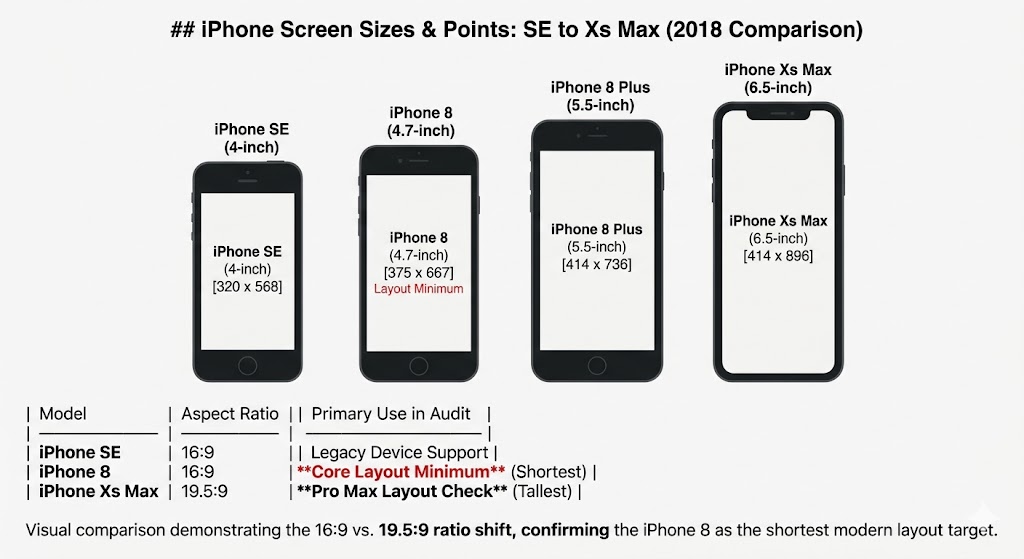
사진 참고.
1
2
3
4
5
6
// profileview
.navigationTitle("Profile")
.navigationBarTitleDisplayMode(DeviceTypes.isiPhone8Standard ? .inline : .automatic)
.toolbar {
   // 생략
}
이런식으로 작성해주면 된다. 참고로 iPhone8의 경우 iOS17 지원이 안된다.
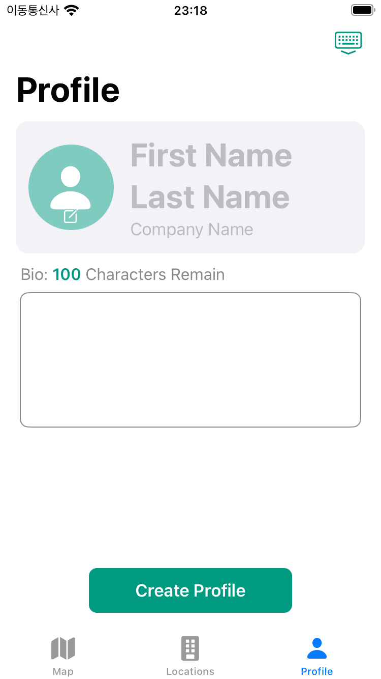
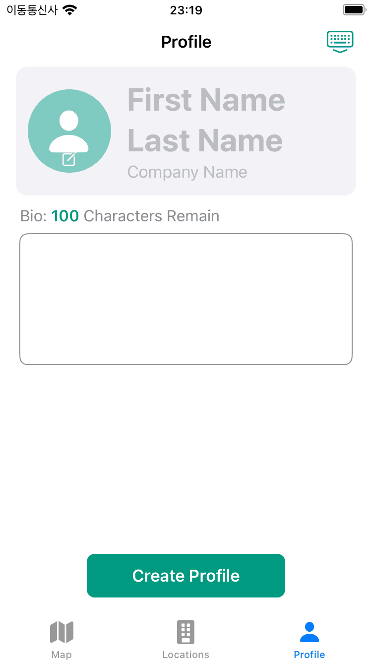
before & after
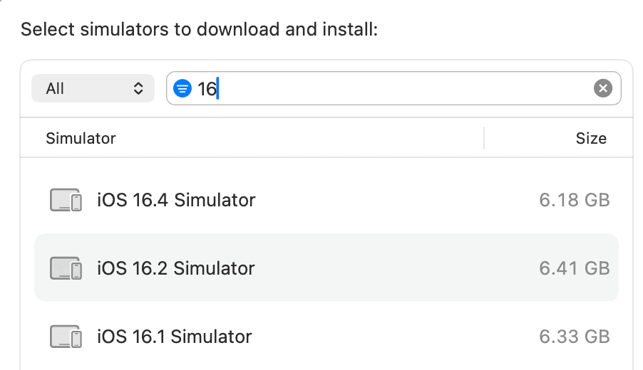
추가로 혹시라도 Simulator에 iPhone8이 없다면 현재 Xcode에 시뮬레이터 버전이 17이상일 가능성이 농후하다.
다들 알겠지만 이럴땐 추가해주면된다.
Github: Dub-Dub-Grub Repository